Candlestick Chart
Overview
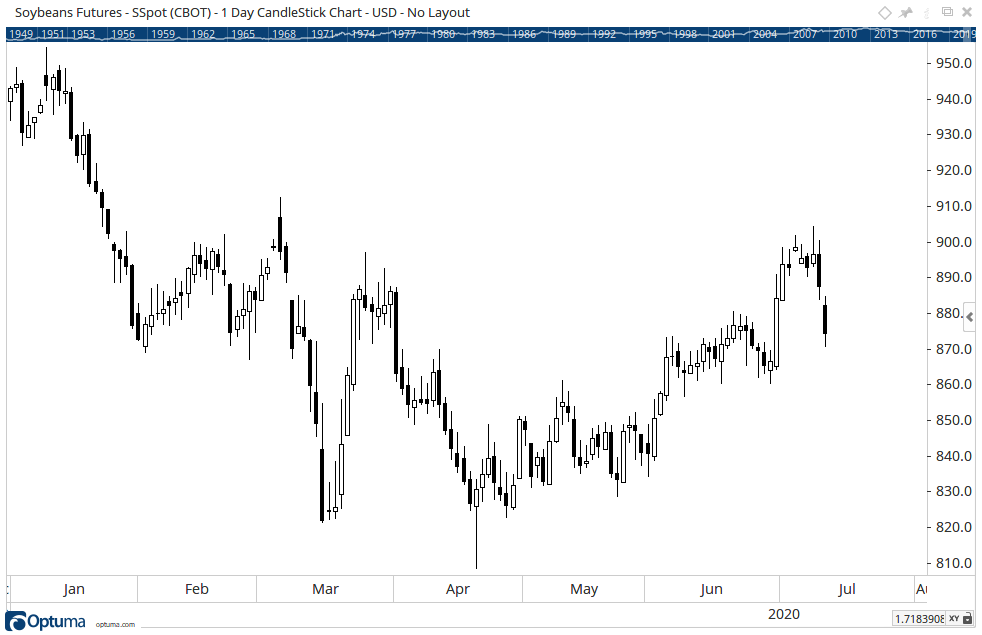
From a Japanese heritage, the candlestick chart shows the open, high, low and close of a period but has the added dimension of showing either a solid body or a hollow body. A solid body shows that the close is below the open and as such is a weak bar. The hollow body shows the close is above the open. It may help to think of a solid candle like lead (heavy and going down) and the hollow candle like a balloon (light and going up).
For Heiken-Ashi Candlestick charts please click here.
Candlesticks are created using open, high, low and close prices - just the same as a bar chart.


Candlestick Pattern Overlay tool
Many people use candlestick charts today to visually search for various patterns in the market, such as a Doji or Bullish Engulfing. To help identify these patterns automatically see the Candlestick Pattern Overlay tool.
Scripting Function: CANDLESTICKPATTERN()
Actions & Properties
Actions

Copy Colours to Toolbar: Copies the candle colour scheme and creates a custom toolbar button. Use the button to apply the colours to other charts.
Copy Data to Clipboard: Copies the raw data values (Open, High, Low, Close, and Volume) to your clipboard, which can then be used in other programs (such as Notepad, MS Excel, etc). Note that the values copied will be in the timeframe of the chart, so a weekly chart will copy weekly values.
Apply Settings to All: Any changes to the chart’s setting can be applied to all the other charts on the page or in the workbook. For example, change the colour scheme or line width of the chart and click this option to automatically change all the other charts in the workbook.
Move to Back: If the lines of the candlesticks are displaying in front of other tools or indicators clicking this action will move the lines view to the background.
Move to Front: If the lines of the candlesticks are displaying behind other tools or indicators on the chart, clicking this action will bring the lines to the forefront.
Restore Default Settings: Click this action if you have adjusted the default settings of the chart, and wish to return to the standard properties originally installed with Optuma.
Save Settings as Default: If you have adjusted any of the chart’s properties (such as the Colour Scheme or bar thickness, for example) you can save the adjustments as your new default setting. Each time you open a new chart it will display using the new settings.
Delete: Deletes the chart from the page.
Properties

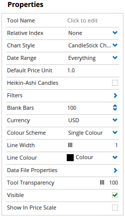
Tool Name: Allows for the name of the chart to be changed, as displayed in the Structure Panel.
Relative Index: Use this option to create a relative strength chart. Type the symbol of the index or other security, eg SPX from World Indices to see the chart relative to the S&P500 index.
Chart Style: Allows you to change the candlestick chart to another chart style (such as a Line Chart).
Date Range: This setting allows you to choose how much historical data is displayed on the chart. By default, all data contained in the data file is displayed but this option can be used to limit the amount of data in the chart, eg Last 10 Years, or from a user-defined date or range of dates.
Default Price Unit: Used to set the Price Unit various Gann-based tools will use by default when applied to the selected chart. For example, setting the Default Price Unit to 0.01 will set any Gann Fan applied to the chart to use 0.01 as its price unit. For more information on the Price Unit, please click here.
Filters: Mouse over this option to open the Filters panel:
- Calendar Days - Ticking this option will add a dash for every day on the chart not filled by an existing bar, such as weekends and public holidays.
- Show Blanks - When enabled a dash will be added for weekdays where no trading activity is recorded (public holidays for example), however, no dashes will be added for weekends.
- Ignore Dilutions - Optuma data is adjusted for share splits, capital adjustments etc. When this option is ticked, any historical adjustments on the chart are ignored.
- Allow Zero Close Price - There are codes in Bloomberg that are binary plots i.e. 0 and 1s only. This filter allows the zero values to be displayed.
- Ignore Out of Session Ticks - Any data coming in outside of the designated session times (assigned to the specific code in use) will not be added to the chart. Requires a real-time datafeed.
- Show Single Session - For codes containing two sessions in a single day (e.g. Session 1 = Day, Session 2 = Night). Ticking this checkbox will allow you to view only one of those sessions on the chart, with data from the other session being hidden from view. Requires a real-time datafeed.
Blank Bars: The number of blank bars to the right of the current price action. After the last bar, there will be an area of blank charting space used for plotting tools and indicators into the future. Increasing this value will increase the amount of blank space.
Currency: Each chart you load will display in the default exchange currency (or point measurement). You can adjust the chart so that it displays in a different currency, or even priced in Silver or Gold.
Colour Scheme: Controls the colours used to display the bars on the chart. There are seven preset colour schemes available:
- Single Colour - One colour displayed for all bars, regardless of their position / price action.
- Time Intervals - Bars are coloured in 2 groups. On a daily chart, the colours change between each week (for example Week 1 would be blue, Week 2 Green, Week 3 Blue, etc).
- Bar Strength - Bars which close higher than their open are blue, bars which close lower than their open are red and bars which have an equal open and close are green. The intensity of the colour is also based on the price range of the bar. The greater the range of the bar, the more intense the colour.
- Swing Relations - Based on W.D. Gann’s swings, by default the higher bars are coloured green and lower bars coloured red. Inside bars (bars where the Open/High/Low/Close occur entirely within the range of the previous bar) are coloured black and outside bars (bars where the high/low are higher/lower than the previous bars) are coloured blue.
- Strength - Bars which close higher than their open are blue and bars which close lower than their open are red.
- Close Position - Bars which close higher than the previous bars are coloured blue. Bars which close lower than the previous bars are coloured red.
- Coloured Volume - When selected, a coloured volume overlay will be displayed over the chart. The tool overlays a colour on each bar in the chart to represent the range of volume traded on that day. The volume ranges are completely user definable.
- RRG Quadrant Bars - This colour scheme will paint each bar or candle by the same colour as the RRG Quadrant that it was in on that date time. The RRG calculation is based on the Relative Strength of the security against the Index shown in the properties when RRG Quadrants is selected.
- RRG Trend Bars - This study paints the bars or candles in a regular chart based on trend-following trading rules that were the basis for the development of the RRG.
- Custom - Allows a custom, user-defined colour scheme to be created using the Optuma Scripting Language.
Volume Colours: When the Colour Scheme is set to Coloured Volume, this menu item becomes available. Click on this option to display the different volume levels. To add a volume level to the chart, left-click on the blue + button and enter the values as needed.
- Value - Sets the volume value for the bar colour. To change the value amount, click in the field and enter the new value.
- Line Style - Sets the colour for the specific volume overlay value.
- Visible - To hide a level, deselect the check box with the green tick
Line Width: Use this slider bar to adjust the thickness of the bars on the chart.
Data File Properties: This field can be expanded to display information on the data file being used to generate the chart. Items such as the Data File’s name, Exchange, physical location on your system are all displayed here. Generally, this information is only required for troubleshooting purposes and is not something you will use on a regular basis.
Tool Transparency: This slider bar is used to adjust the transparency of the chart itself. Moving the slider to the left will increase the transparency of the bars. Moving the slider to the right will increase the opacity of the chart.
Visible: Unticking the checkbox will hide the bar chart from view.
Show in Price Scale: When selected the last closing value will be highlighted in the Price Scale.
More Information
For additional information on editing the volume levels, when colour scheme is set to Coloured Volume, click here.