High/Low Degree Angles


Overview
The main concept that needs to be understood when using a Gann Fan is the relationship between time and price that Gann proposed. This means that for one unit of time the market will rise (or fall) by one unit of price, resulting in a one-by-one line (1 x 1). The High/Low Degree Angles tool uses this same principle but draws vertical lines when the fan angles meet user-defined levels.
The resulting lines can be used to help identify potential turning points in the market.

To add the tool to your chart, select the tool from the Gann tool group, and left-click on the bar on the chart you wish to calculate the tool from. Next, extend the lines and left-click again where you want it to end. Optuma will then draw the tool using the default settings.
Actions & Properties
Actions

Add to Toolbar: Adds the selected tool to your custom toolbar.
Apply Settings to All: When multiple High/Low Degree Angles tools have been applied to a chart, page or workbook, this action can be used to apply the settings of the one selected to other instances of the tool. This is a great time saver if an adjustment is made to the tool - such as line colour - as this allows all the other High/Low Degree Angles tools in the chart, page or entire workbook to be updated instantly.
Copy Tool: Allows you to copy the selected tool, which can then be pasted onto a different chart window.
Move to Back: If the tool is displaying in front of other tools or indicators clicking this action will move the tool view to the background.
Move to Front: If the tool is displaying behind other tools or indicators on the chart, clicking this action will bring the tool to the forefront.
Restore Default Settings: Click this action if you have adjusted the default settings of the tool, and wish to return to the standard properties originally installed with Optuma.
Save Settings as Default: If you have adjusted any of the tool’s properties (colour, for example) you can save the adjustments as your new default setting. Each time you apply a new High/Low Degree Angles to a chart, the tool will display using the new settings.
Delete: Deletes the tool from the chart.
Properties

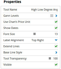
Tool Name: Allows for the name of the tool to be changed, as displayed in the Structure Panel.
Gann Levels: Click on this option to display the different Gann Fan Angle levels.
To add a new level to the chart, left-click on the blue + button and enter the values as needed.
- Value - Sets the time/price ratio for the angle (e.g. 1 x 2). To change the value amount, click in the field and enter the new value.
- Line Style - Sets the line type, thickness, colour and transparency of the angle lines.
- Visible - To hide a level, deselect the check box with the green tick.
Use Chart’s Price Unit: By default, the price unit of the chart is used in the tool calculation. Untick the box to manually adjust the value in the Price Unit property.
Price Unit: This option is available when the Use Chart’s Price Unit box is unticked (see above). The value in this field determines what one unit of price is equal to in the tool’s calculation. This may require adjustment depending on the data file and time-frame that the Gann tool is applied to. To change the value, simply click in the field and enter a new value. For more information click here.
Show Dates: Check this box to display the date value of the angle lines.
Font Size: If Show Dates is selected you can adjust the size of the text displayed for each label. Moving the slider bar to the right increases the font size.
Label Alignment: The price label can be placed in different positions in relation to the division lines. There are 8 options available: Top Left, Top Right, Centre Top, Bottom Left, Bottom Right, Centre Bottom, Centre Left and Centre Right.
Extend Lines: Check this box to extend the angle lines.
Base Line Style: The Line Style property allows you to adjust the type of the horizontal and vertical baselines, including width and colour. There are 8 options available: Solid, Dots, Dash, Dash Dots, Long Dash, Long Dash Dot, Long Dash Dot Dot and Stippled.
Tool Transparency: Use this slider bar to adjust the transparency of the tool. Moving the slider to the left will increase the transparency of the tool.
Visible: Un-tick this checkbox to hide the tool from the chart.